Unveiling the Secrets of Ghosted Domains
Explore the intriguing world of expired domains and online opportunities.
Type It Right: Web Typography That Speaks Volumes
Unlock the secrets of impactful web typography! Discover expert tips to make your text speak volumes and elevate your online presence.
The Power of Font Choice: How Typography Transforms Web Design
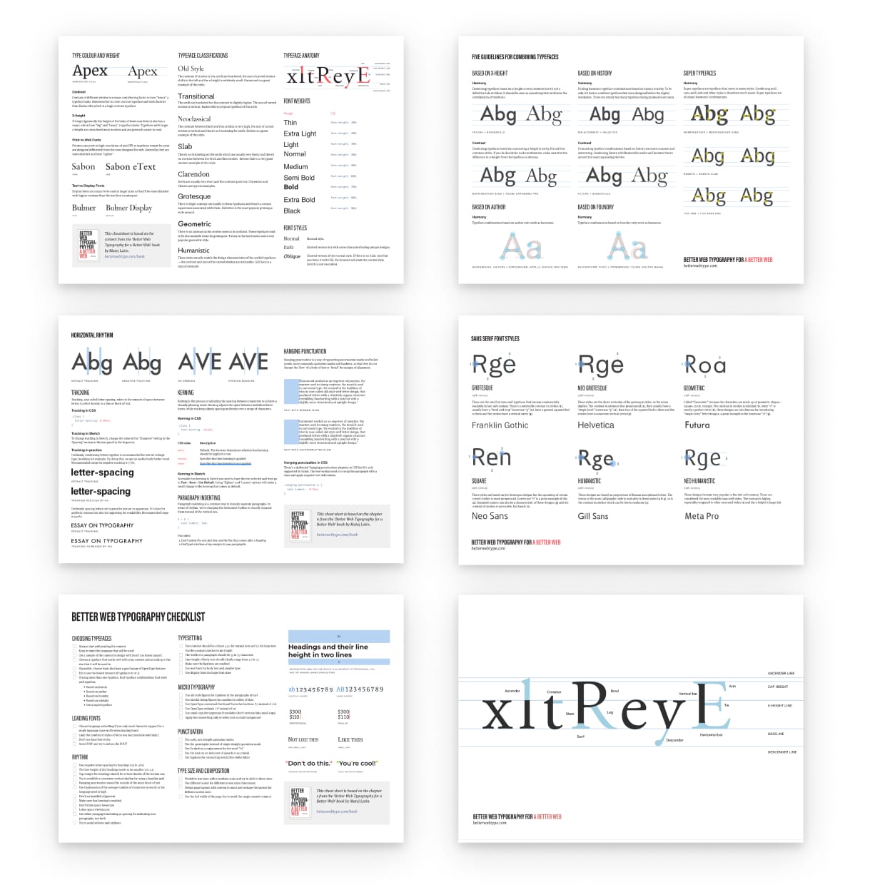
Typography plays a crucial role in web design, acting as the bridge between aesthetic appeal and functional readability. The choice of font directly impacts user experience, influencing how content is perceived and understood. A well-selected font not only enhances the visual hierarchy of the page but also conveys the brand's personality. For instance, sans-serif fonts are often associated with modernity and cleanliness, making them ideal for tech companies, while serif fonts exude tradition and reliability, suitable for brands in finance or publishing.
Moreover, typography contributes significantly to SEO and accessibility. Search engines take into account how easily users can read and navigate a website. By choosing the right font, you can improve engagement metrics such as time on site and bounce rate. Additionally, incorporating features like responsive typography ensures that text remains legible across devices, catering to a broader audience. Ultimately, a thoughtful approach to typography can transform a web design from ordinary to extraordinary, creating a memorable experience that keeps visitors coming back.

10 Essential Typography Tips for Enhancing User Experience
Typography plays a crucial role in enhancing user experience on websites and blogs. One of the most important tips is to establish a clear hierarchy using different font sizes and weights. This way, users can easily navigate through content and identify headings, subheadings, and body text. Consistency is key; using the same typefaces across your pages creates a professional look and fosters brand recognition. Furthermore, choosing appropriate line spacing can greatly affect readability, as text that is too cramped can discourage reading. Aim for a line height of 1.5 to 1.8 times the font size for optimal results.
Another essential tip is to limit the number of font families you use. A good rule of thumb is to stick to two or three fonts per page to maintain coherence and avoid visual clutter. Additionally, consider the contrast between your text and background. High contrast, such as black text on a white background, improves legibility, especially for users with visual impairments. Always test your typography on various devices and screen sizes to ensure a seamless user experience, as well. Implementing these typography tips will help create an engaging and accessible environment for your readers.
Is Your Web Typography Speaking the Right Language?
Typography is more than just choosing a font; it's about crafting a visual language that speaks to your audience. When done correctly, your web typography can enhance readability, convey brand identity, and ultimately drive user engagement. By selecting the right font styles, sizes, and line spacing, you can create a hierarchy that guides your readers through your content smoothly. Is your web typography speaking the right language? It’s crucial to analyze how the choices you make in typography can influence the way your message is perceived.
Consider the emotions and associations that different fonts can evoke. For instance, serif fonts often communicate tradition and reliability, making them perfect for professional services, whereas sans-serif fonts can feel modern and approachable, ideal for tech startups. Additionally, pay close attention to contrast between text and background colors, as well as the use of white space, which significantly impacts readability. Ultimately, your typography should not only enhance your content but also ensure that it resonates well with your target audience, creating a cohesive and engaging experience.